Pastel Mumu was a spontaneous request from a family friend. They sell Indonesian pastries in the heart of Australia. They did not need anything fancy or exclusive - just a logo with that playfully depicts what the offering in store is.
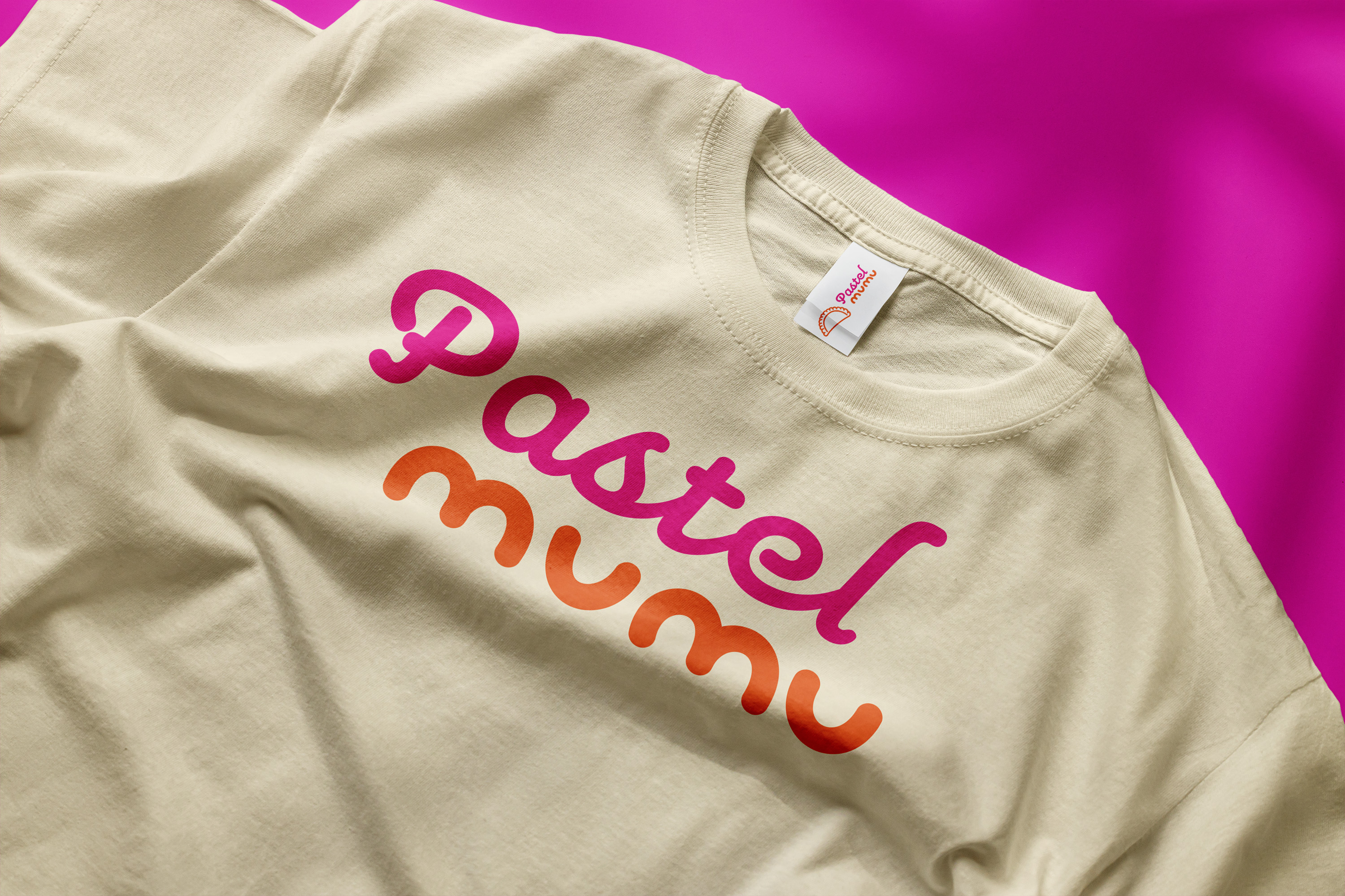
I needed to create something ultimately versatile, primarily for stickers. Despite the initial request deal being a logo and a color palette, I developed the concept further to feature a branding, to see the brand flourish into a proper chain in Sydney.
The initial logo presented to me was very outdated. It lacked various basic logo design concepts that would’ve made it strong, unique, and versatile - containing too many words, colors, and lacked hierarchy. Despite all this, it was clear on the brief and initial iterations that the product needed to be represented in the logomark.
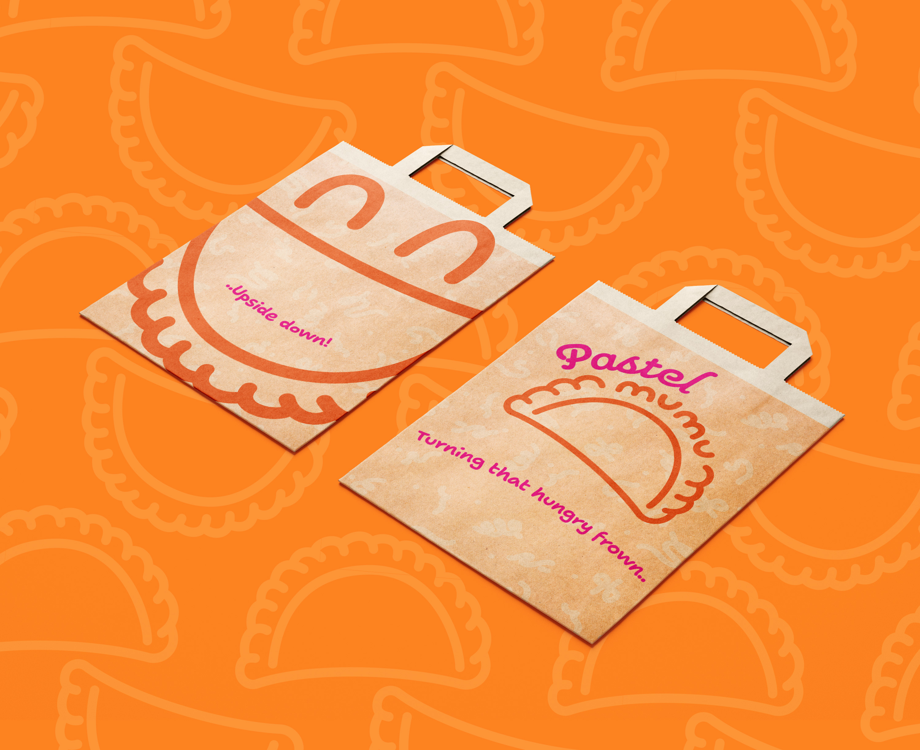
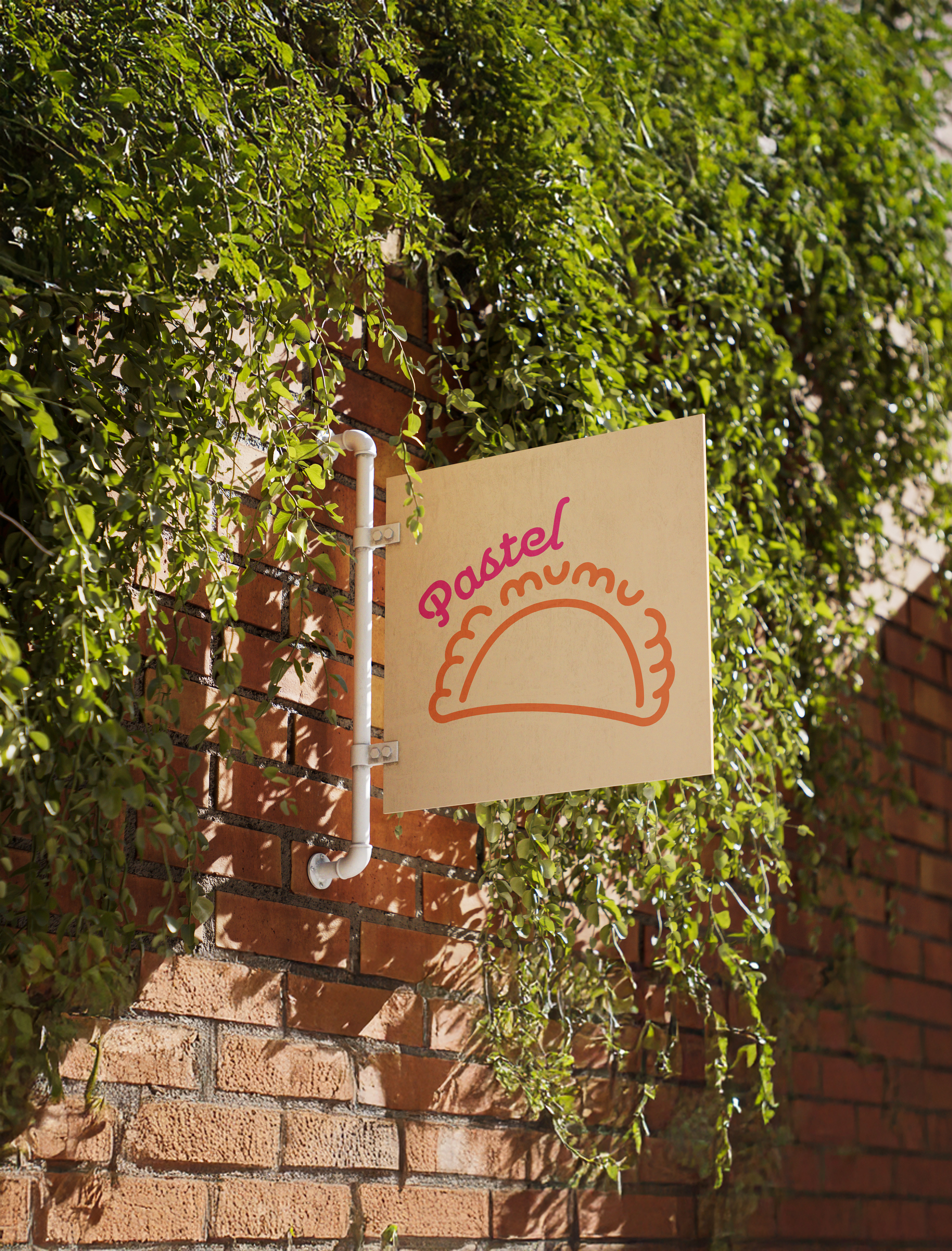
Pastel Mumu wanted to expand beyond just a singular shop, expanding across Sydney not only for deliveries, but also new stores. Sydney is a bright and colorful place - believe me I’ve been there. To have Pastel Mumu blend in with the city was important for the brand, while displaying the hospitality that the Indonesian culture always brought to guests.
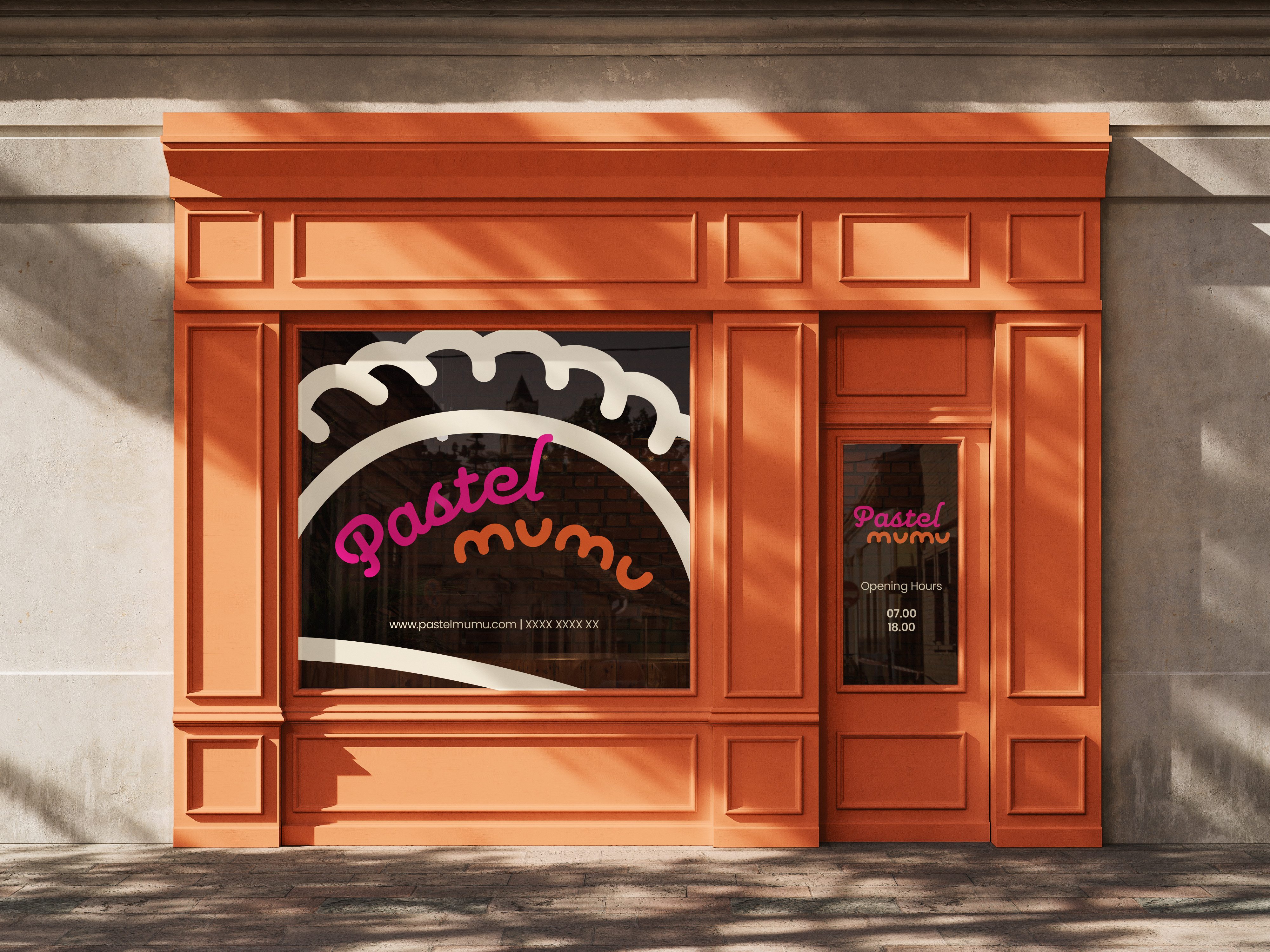
Growing up, I have devoured countless pastels - I knew this pastry inside out. The sketching progressed quicker than usual, I iterated several designs that pivoted to the word “Mumu” integrated into the crust. The final result felt natural and justified.
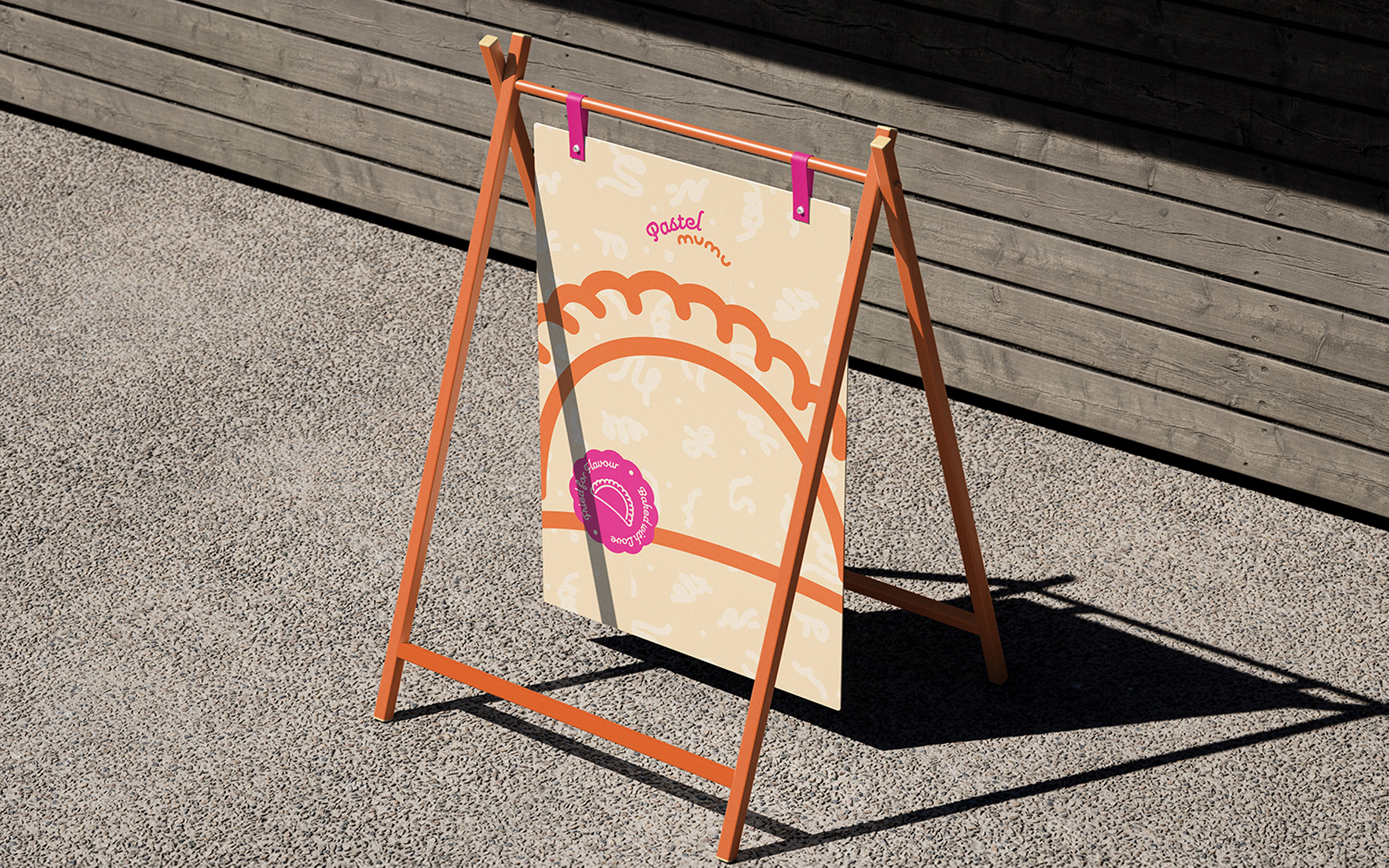
The mandarin orange and sandy yellow was an excellent pairing, with the cream to wrap it all together. To push the brand beyond the static color palette, the hot pink screamed to audiences perfectly and was the final ingredient to this brimming recipe of a brand.
The pastel pastry is not one fixed recipe, they come in different toppings - the randomness of the ingredients always please with each bite. To capture that flavor, I delved into patterns; utilizing squiggles, swirls, and dots to illustrate the toppings. Ultimately combining all these concepts into a versatile brand pattern.