The Heir of Time was a progressive request for my design work. They are run by Just Just Productions, an upcoming animated TV series set in a sci-fi/fantasy world. It was an ambitious project that required some design nudging to progress.
I was brought on initially to design a title graphic for the show’s intro, but quickly offered to upgrade my services to brand the entire project.

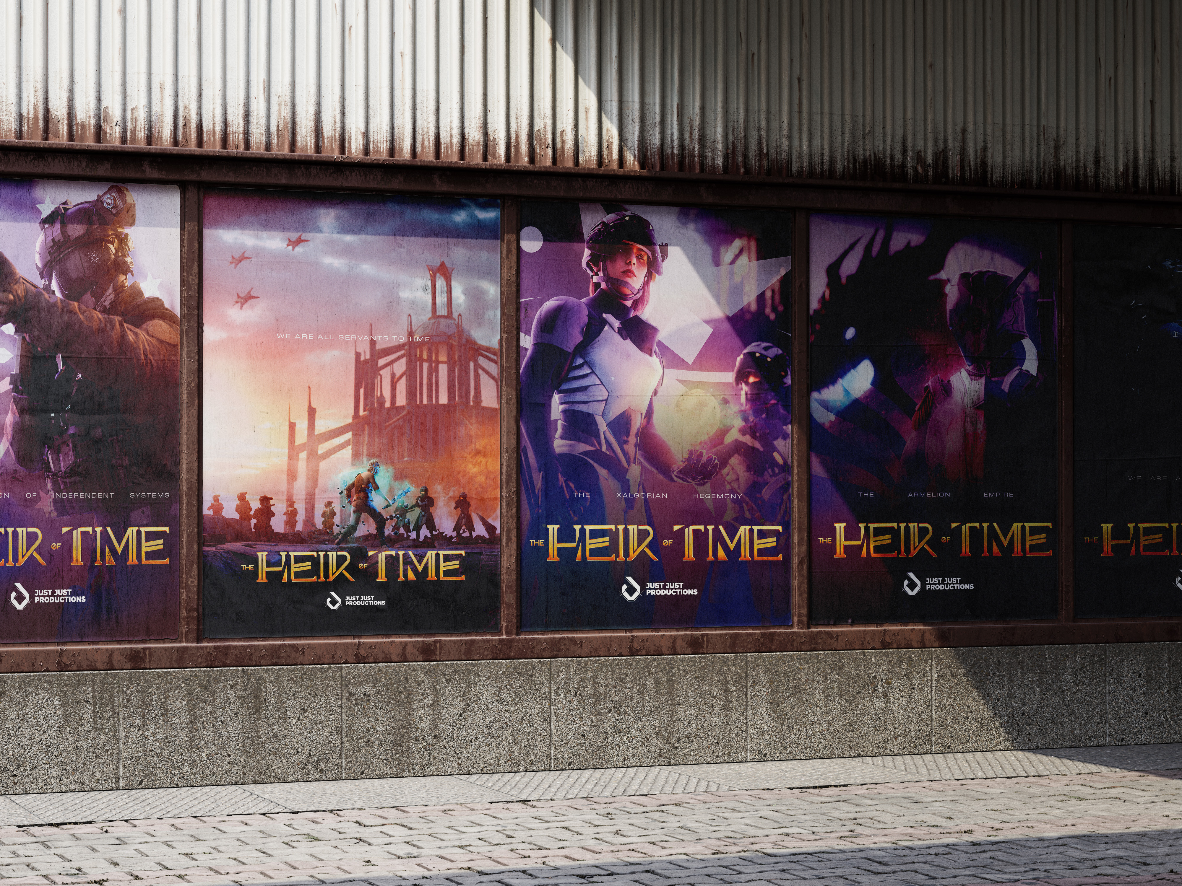
The Heir of Time follows an elven princess caught between a intergalactic war where she also struggles to control her time-jumping abilities. Marco from Just Just Productions asked me to design a logo/title graphic that suited these mix of ideas, a fantasy feel that belongs to a sci-fi IP. Initially, the title graphic shown to me was described as cheap, generic, and says nothing about the scope of the series.
For this series to grow into an IP, they needed a brand. The project was split into different media and never really captures the same energy for each content being churned out. They were excellent at drawing first impressions, but struggle to maintain or reinvite viewers. They needed a color palette, a typeface, and a glow up. Every great franchise nowadays has consistency in branding - Star Wars, Dune, & Arcane.
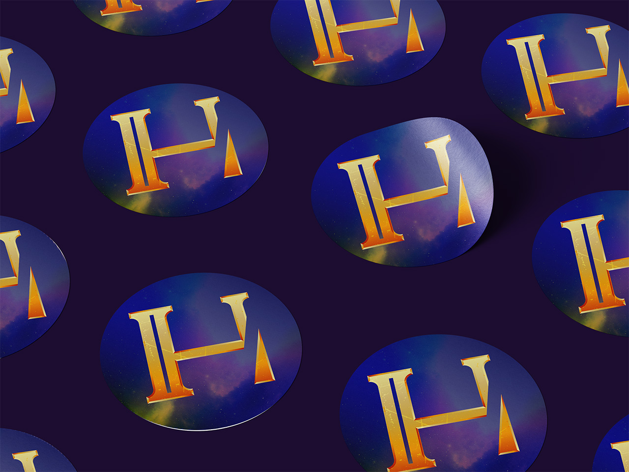
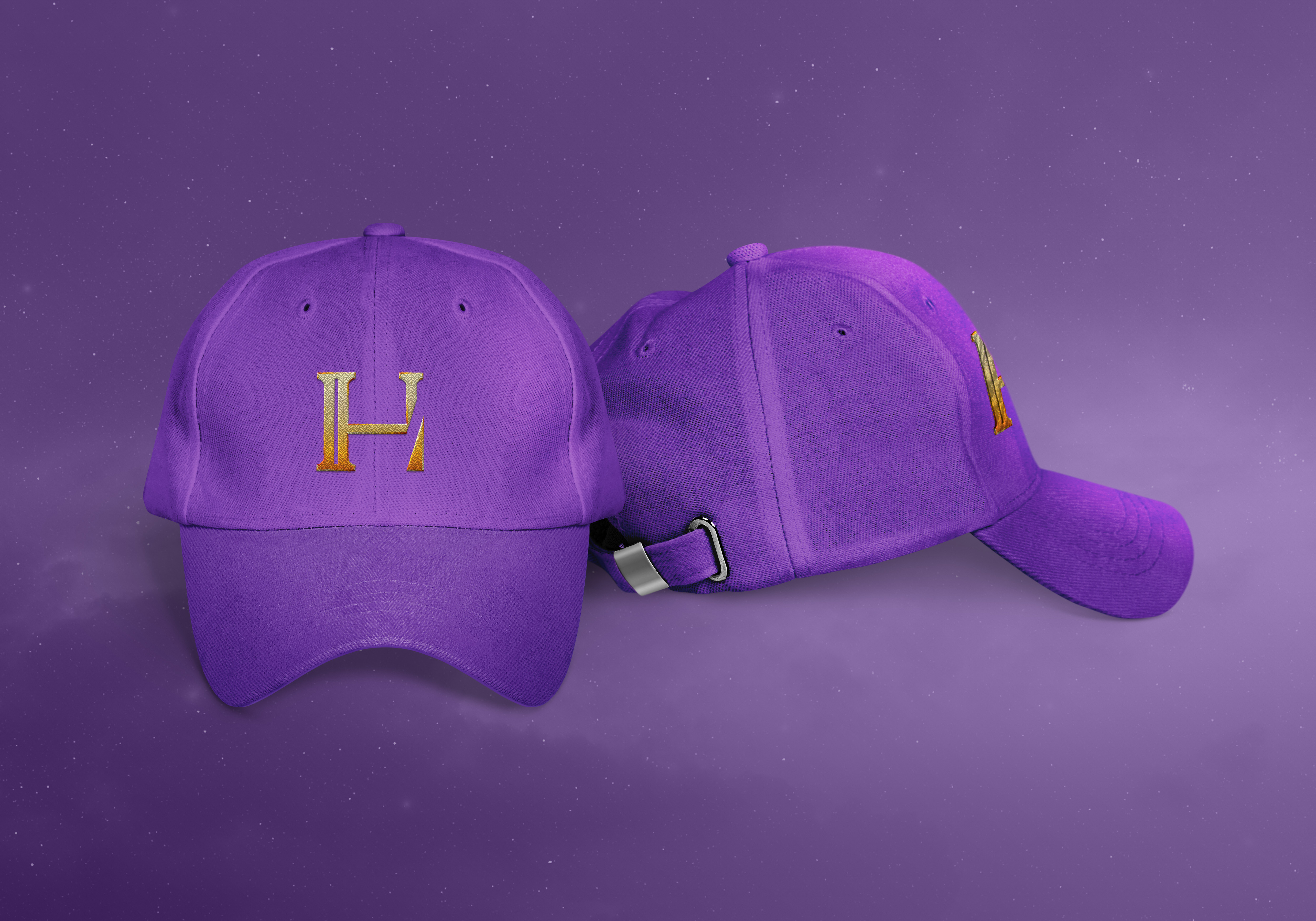
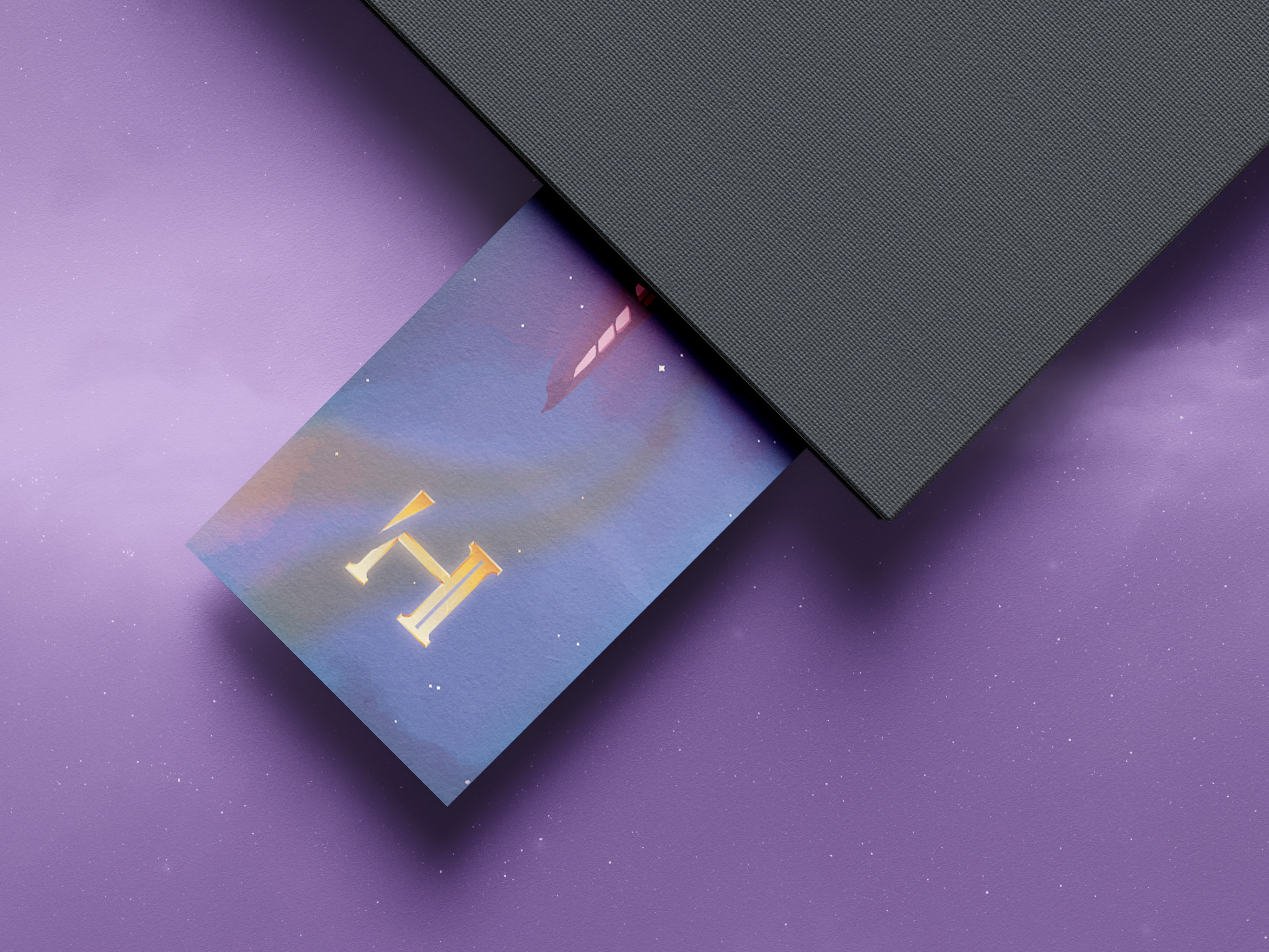
After several iterations and two discussion calls, the logo became a mix of splitting lines and sharp edges.
The splitting lines symbolizes the diverging timelines, how the main character, Sel, jumps between back and forth uncontrollably throughout the story. The use of thin, elongated rectangles as the building blocks of the letters combined with the curves and scratched, gold texture marry the sci-fi and fantasy themes together.
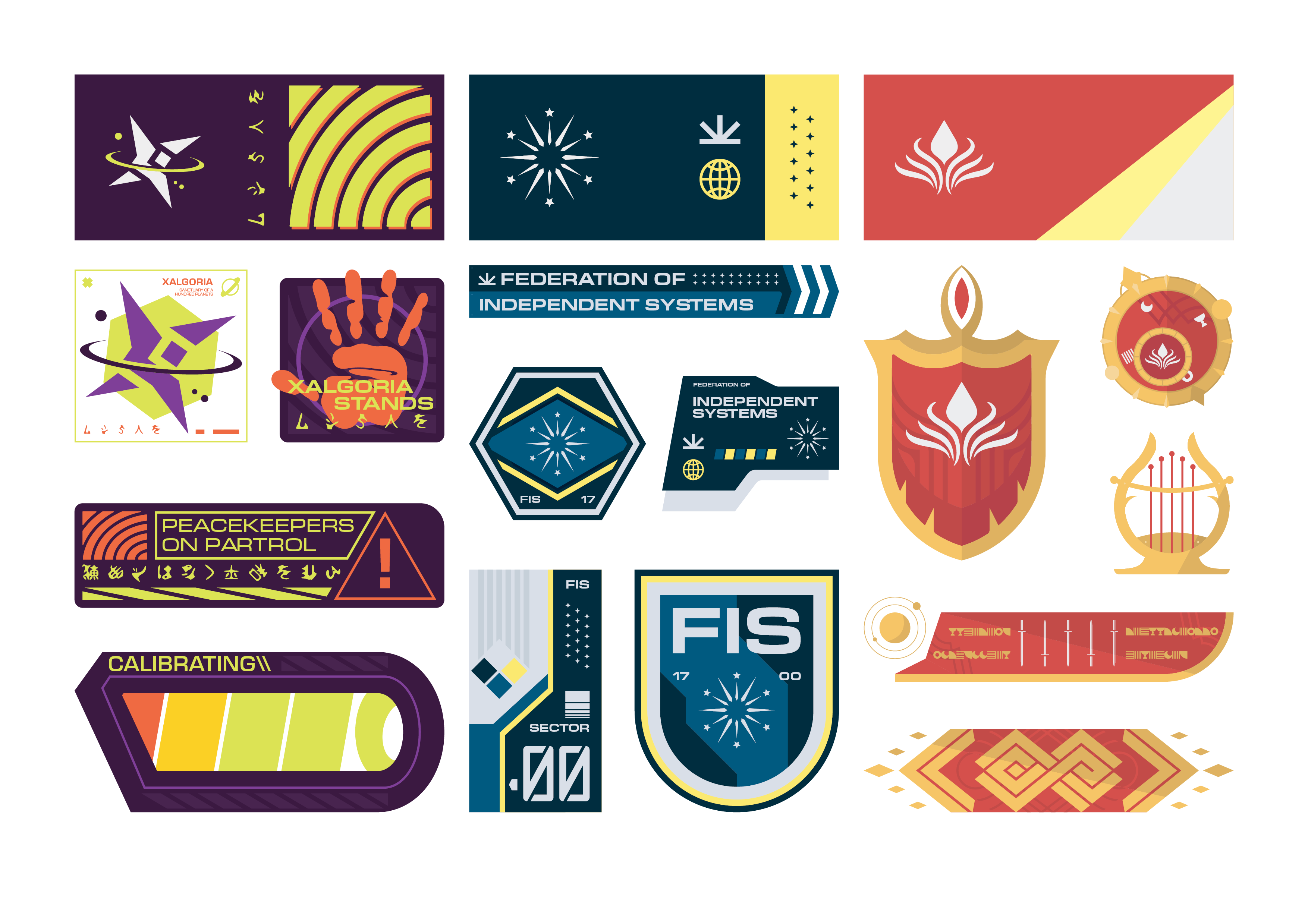
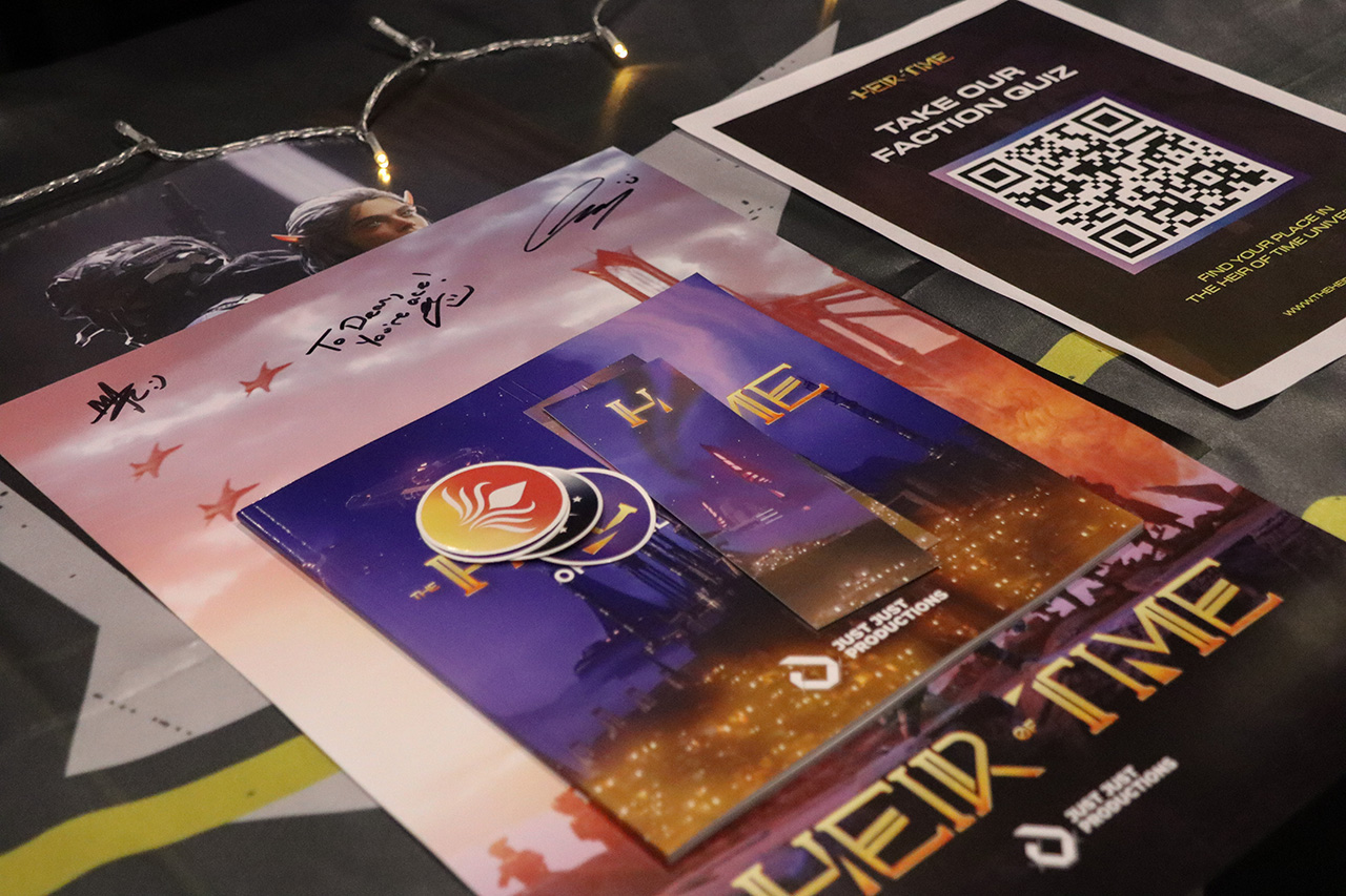
Branding started where the logomark ended, the colors. We decided on a purple color to differentiate the main brand from the factions while also complementing the gold accents. Marco and his team were ecstatic by this direction and quickly adopted to their MCM Comic Con stand.
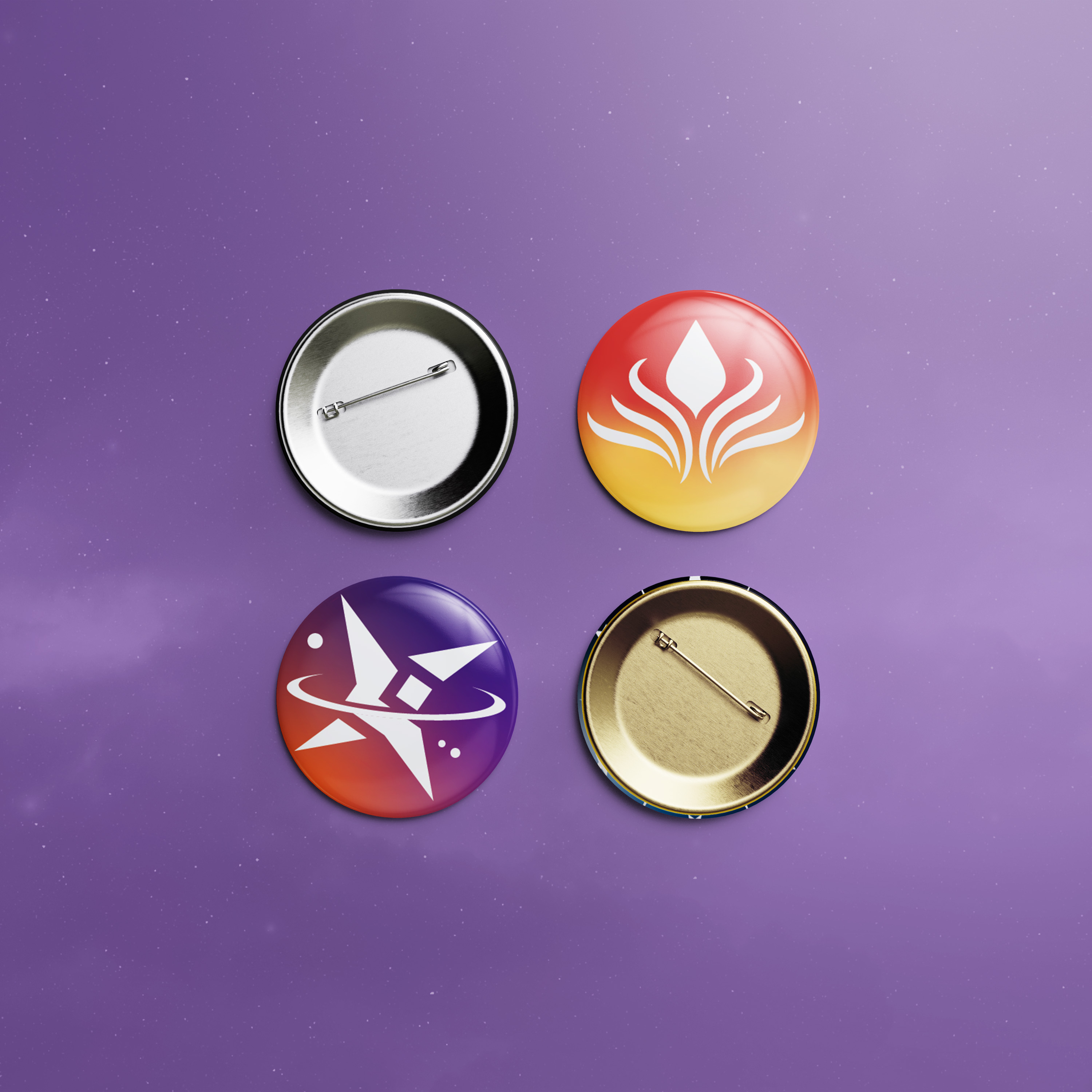
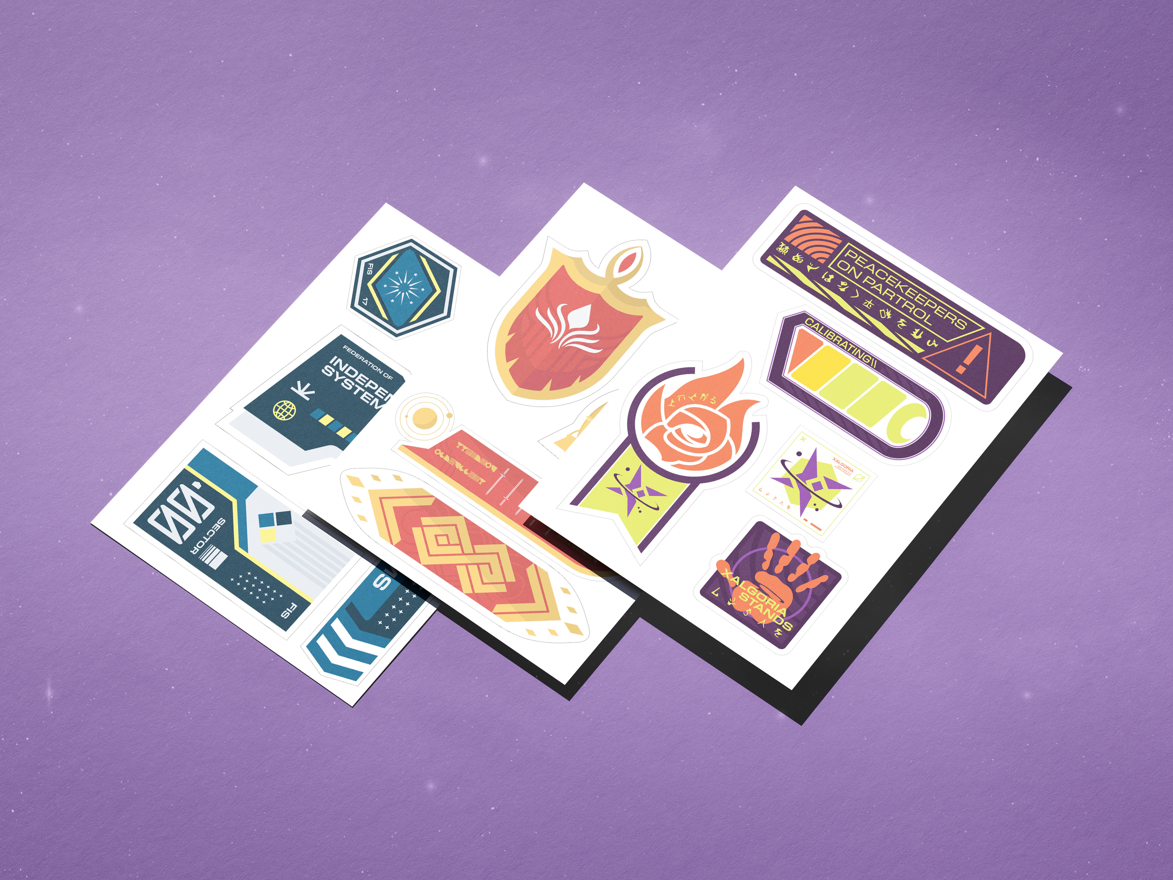
The identity of Xalgoria was a lot more free compared to the other two factions, and I was granted creative freedom. I chose to work with complementary colors of orange and purple while sprinkling in neon green to maximise the dystopian vibe of the Xalgorian branding. A fun spin I did for the ‘Xalgorian lingo’ was the use of Japanese/Chinese letters and smoothening them in Illustrator to create alien typography.
As for the other two, I kept a straight forward approach. For the FIS, I used rigid and pointed edges to illustrate their cold nature. The use of mundane icons and repetition creates a familiar human look.
The Armelion relied heavily on curves, inspired by vines and flowers. The icons used in the artwork were simplified with simple shapes to contrast with the defined line details in the background.